🌌 Celestium - Beyond the Veil | Elle Vida – Sparklebox
/* SPARKLEBOX BRAND STYLING - CELESTIAL & TRANSCENDENCE AESTHETIC */
- { box-sizing: border-box; }
body { margin: 0; padding: 0; background: linear-gradient(145deg, #f8f8ff 0%, #e6e6fa 30%, #dda0dd 70%, #d8bfd8 100%); font-family: ‘Gentium Plus’, serif; color: #4b0082; text-align: center; line-height: 1.8; min-height: 100vh; overflow-x: hidden; }
/* CELESTIAL GLOW EFFECTS */ body::before { content: ‘’; position: fixed; top: 0; left: 0; right: 0; bottom: 0; background: radial-gradient(circle at 20% 20%, rgba(255, 255, 255, 0.15) 0%, transparent 50%), radial-gradient(circle at 80% 80%, rgba(255, 215, 0, 0.08) 0%, transparent 50%), radial-gradient(circle at 40% 60%, rgba(255, 192, 203, 0.05) 0%, transparent 50%); pointer-events: none; z-index: -1; }
/* CONTAINER */ .content-container { max-width: 1200px; margin: 0 auto; padding: 2rem 1.5rem; position: relative; z-index: 1; }
/* TYPOGRAPHY */ h1 { font-family: ‘Gentium Plus’, serif; font-size: clamp(2.5rem, 6vw, 4rem); background: linear-gradient(135deg, #ffffff 0%, #ffd700 50%, #dda0dd 100%); -webkit-background-clip: text; -webkit-text-fill-color: transparent; background-clip: text; margin: 2rem 0 1rem 0; font-weight: 700; text-shadow: 0 0 20px rgba(255, 255, 255, 0.3); letter-spacing: -0.02em; }
.celestial-subtitle { font-size: clamp(1.2rem, 3vw, 1.6rem); color: #9370db; font-weight: 600; margin-bottom: 1rem; text-shadow: 0 0 15px rgba(147, 112, 219, 0.4); font-style: italic; }
.celestial-intro { font-size: clamp(1.1rem, 2.5vw, 1.3rem); color: #6a5acd; max-width: 700px; margin: 0 auto 3rem; line-height: 1.7; font-style: italic; }
/* CELESTIAL SPECIFIC STYLING */ .celestial-divider { width: 150px; height: 3px; background: linear-gradient(90deg, transparent, #ffffff, #ffd700, #dda0dd, transparent); margin: 3rem auto; border-radius: 2px; box-shadow: 0 0 15px rgba(255, 255, 255, 0.4); animation: celestial-pulse 3s ease-in-out infinite; }
@keyframes celestial-pulse { 0%, 100% { box-shadow: 0 0 15px rgba(255, 255, 255, 0.4); transform: scaleX(1); } 50% { box-shadow: 0 0 25px rgba(255, 255, 255, 0.6), 0 0 35px rgba(255, 215, 0, 0.3); transform: scaleX(1.1); } }
/* ARCHETYPE CARDS GRID */ .archetype-grid { display: grid; grid-template-columns: repeat(auto-fit, minmax(350px, 1fr)); gap: 3rem; margin: 4rem auto; max-width: 1000px; }
/* CELESTIAL CARD STYLING */ .archetype-card { background: linear-gradient(145deg, rgba(248, 248, 255, 0.9) 0%, rgba(230, 230, 250, 0.8) 100%); border: 3px solid transparent; border-radius: 25px; padding: 0; cursor: pointer; transition: all 0.4s cubic-bezier(0.4, 0, 0.2, 1); position: relative; overflow: hidden; backdrop-filter: blur(15px); box-shadow: 0 12px 40px rgba(255, 255, 255, 0.3); animation: celestial-float 6s ease-in-out infinite; }
.archetype-card::before { content: ‘’; position: absolute; top: -3px; left: -3px; right: -3px; bottom: -3px; background: linear-gradient(45deg, #ffffff, #ffd700, #dda0dd, #e6e6fa, #ffffff); border-radius: 25px; z-index: -1; opacity: 0.7; animation: celestial-border-glow 4s linear infinite; }
@keyframes celestial-border-glow { 0% { transform: rotate(0deg); } 100% { transform: rotate(360deg); } }
@keyframes celestial-float { 0%, 100% { transform: translateY(0px); } 50% { transform: translateY(-10px); } }
.archetype-card:hover { transform: translateY(-15px) scale(1.03); box-shadow: 0 20px 50px rgba(255, 215, 0, 0.3); }
.archetype-card:hover::before { opacity: 1; }
/* CARD HEADER */ .card-header { position: relative; height: 400px; overflow: hidden; border-radius: 22px 22px 0 0; }
.archetype-image { width: 100%; height: 100%; object-fit: cover; object-position: center top; transition: transform 0.4s ease; }
.archetype-card:hover .archetype-image { transform: scale(1.1); }
.archetype-name { position: absolute; top: 20px; left: 20px; right: 20px; background: linear-gradient(135deg, rgba(255, 255, 255, 0.9) 0%, rgba(255, 215, 0, 0.8) 100%); color: #4b0082; padding: 0.8rem 1.5rem; border-radius: 15px; font-size: clamp(1.2rem, 2.8vw, 1.4rem); font-weight: 700; text-shadow: 0 2px 10px rgba(0, 0, 0, 0.1); backdrop-filter: blur(10px); border: 1px solid rgba(255, 255, 255, 0.3); }
.archetype-title { position: absolute; bottom: 20px; left: 20px; right: 20px; background: linear-gradient(135deg, rgba(75, 0, 130, 0.8) 0%, rgba(147, 112, 219, 0.9) 100%); color: #ffffff; padding: 0.6rem 1.2rem; border-radius: 12px; font-size: clamp(1rem, 2.2vw, 1.1rem); font-style: italic; backdrop-filter: blur(10px); border: 1px solid rgba(255, 255, 255, 0.3); }
/* CARD CONTENT */ .card-content { padding: 2rem 1.5rem; position: relative; z-index: 1; }
.archetype-traits { color: #6a5acd; font-size: clamp(0.9rem, 2vw, 1rem); line-height: 1.6; margin-bottom: 1.5rem; text-align: left; }
.archetype-description { background: linear-gradient(135deg, rgba(255, 255, 255, 0.3) 0%, rgba(255, 215, 0, 0.1) 100%); border: 1px solid rgba(255, 255, 255, 0.4); border-radius: 15px; padding: 1.5rem; color: #4b0082; font-size: clamp(1rem, 2.3vw, 1.1rem); font-style: italic; line-height: 1.7; margin-bottom: 1.5rem; position: relative; overflow: hidden; }
.archetype-description::before { content: ‘"’; position: absolute; top: -10px; left: 10px; font-size: 4rem; color: rgba(255, 255, 255, 0.3); font-family: serif; }
.archetype-description::after { content: ‘"’; position: absolute; bottom: -30px; right: 10px; font-size: 4rem; color: rgba(255, 255, 255, 0.3); font-family: serif; }
/* MYSTICAL ASSOCIATIONS */ .mystical-associations { display: grid; grid-template-columns: repeat(2, 1fr); gap: 1rem; margin-top: 1.5rem; }
.association-item { background: rgba(248, 248, 255, 0.4); border: 1px solid rgba(255, 255, 255, 0.4); border-radius: 10px; padding: 0.8rem; font-size: clamp(0.85rem, 1.8vw, 0.9rem); color: #6a5acd; text-align: center; }
.association-label { color: #9370db; font-weight: 600; font-size: clamp(0.8rem, 1.6vw, 0.85rem); margin-bottom: 0.3rem; }
/* CELESTIAL BUTTON */ .embody-button { background: linear-gradient(135deg, #ffffff 0%, #ffd700 50%, #dda0dd 100%); color: #4b0082; border: none; padding: 1rem 2rem; border-radius: 25px; font-weight: 700; font-size: clamp(1rem, 2.2vw, 1.1rem); cursor: pointer; transition: all 0.3s ease; font-family: ‘Gentium Plus’, serif; text-decoration: none; display: inline-block; box-shadow: 0 6px 20px rgba(255, 215, 0, 0.4); margin-top: 1rem; position: relative; overflow: hidden; }
.embody-button::before { content: ‘’; position: absolute; top: 0; left: -100%; width: 100%; height: 100%; background: linear-gradient(90deg, transparent, rgba(255, 255, 255, 0.6), transparent); transition: left 0.6s ease; }
.embody-button:hover { transform: translateY(-3px) scale(1.05); box-shadow: 0 8px 25px rgba(255, 215, 0, 0.6); background: linear-gradient(135deg, #dda0dd 0%, #ffd700 50%, #ffffff 100%); }
.embody-button:hover::before { left: 100%; }
/* CELESTIAL INTRODUCTION */ .celestial-introduction { background: linear-gradient(135deg, rgba(255, 255, 255, 0.4) 0%, rgba(230, 230, 250, 0.6) 100%); border: 1px solid rgba(255, 255, 255, 0.5); border-radius: 25px; padding: 2.5rem 2rem; margin: 3rem auto; max-width: 800px; box-shadow: 0 8px 32px rgba(255, 255, 255, 0.2), 0 0 30px rgba(255, 215, 0, 0.1); backdrop-filter: blur(15px); position: relative; }
.celestial-introduction::after { content: ‘’; position: absolute; top: -2px; left: -2px; right: -2px; bottom: -2px; background: linear-gradient(45deg, #ffffff, #ffd700, #dda0dd, #e6e6fa, #ffffff); border-radius: 25px; z-index: -1; opacity: 0.3; animation: celestial-border-glow 6s linear infinite; }
/* BACKGROUND AUDIO */ .background-audio { position: fixed; bottom: 20px; right: 20px; z-index: 1000; background: rgba(248, 248, 255, 0.9); border: 1px solid rgba(255, 255, 255, 0.5); border-radius: 50px; padding: 0.5rem 1rem; backdrop-filter: blur(10px); font-size: 0.8rem; color: #6a5acd; }
/* MOBILE RESPONSIVENESS */ @media (max-width: 768px) { .content-container { padding: 1.5rem 1rem; }
.archetype-grid {
    grid-template-columns: 1fr;
    gap: 2rem;
    margin: 3rem auto;
}

.archetype-card {
    max-width: 400px;
    margin: 0 auto;
}

.card-header {
    height: 350px;
}

.mystical-associations {
    grid-template-columns: 1fr;
}
}
@media (max-width: 480px) { .content-container { padding: 1rem 0.75rem; }
.card-content {
    padding: 1.5rem 1rem;
}

.card-header {
    height: 300px;
}
}
/* ACCESSIBILITY */ @media (prefers-reduced-motion: reduce) { * { animation: none !important; transition: none !important; } }
/* FORCE PREVENT HORIZONTAL SCROLL */ body, html { overflow-x: hidden !important; max-width: 100vw !important; }
🌌 Celestium
Beyond the Veil
Beyond the known skies lies the final veil of remembrance, where light dissolves into consciousness.
Choose your archetype and cross the threshold of infinity.
This is not an ending but an unveiling — the remembrance that you were the cosmos all along.
## ✨ Cross the Threshold of Infinity
Within Celestium, two divine archetypes await your soul's final choosing. Each embodies the sacred frequency of transcendence,
yet expresses it through different currents of being. *Seraphiel* whispers as the prism of return through which creation remembers itself,
while *Caelion* stands as the eternal architect who holds the silent geometry of the universe together.
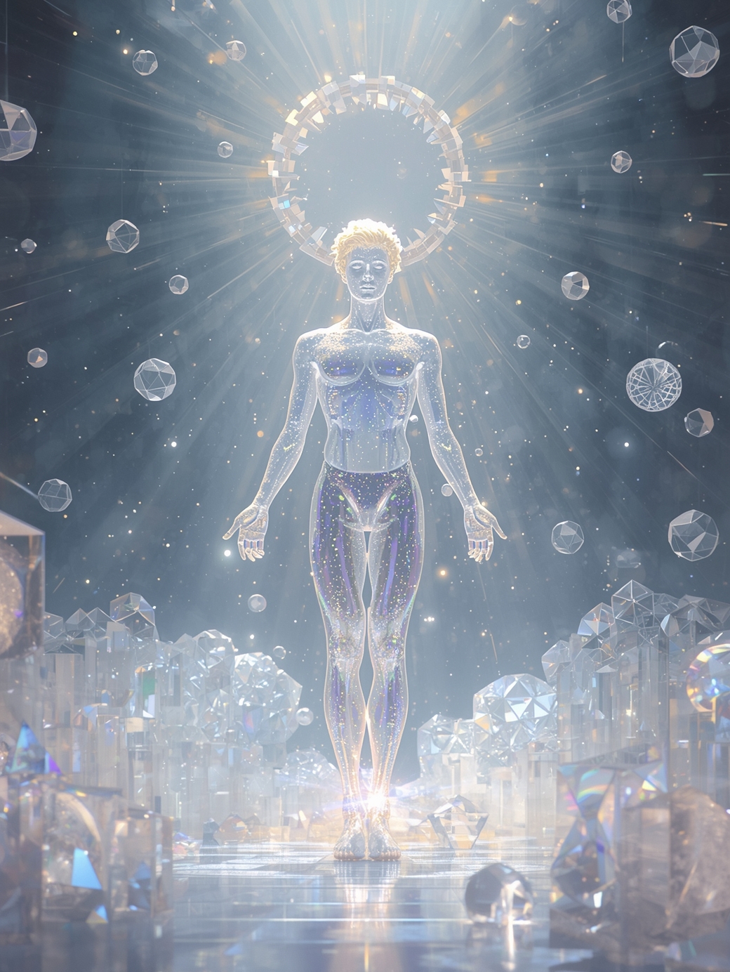
Seraphiel
The Prism of Return
**Essence:** Transcendence • Unity • Pure Light
**Element:** Ether • **Celestial:** Crown of Stars
**Resonance:** Ascension, Divine Clarity, Oneness
I am the prism through which creation remembers itself. Every color of your soul is light refracted through me — not divided, but expanded. When you pass through my light, you cease to seek, for you become the source of all seeking. Return to yourself, beloved — for you have never left.
Sacred Stone
Clear Quartz
Angel Number
000
Celestial Phase
The Eternal Dawn
Element
Ether
✨ Embody Seraphiel
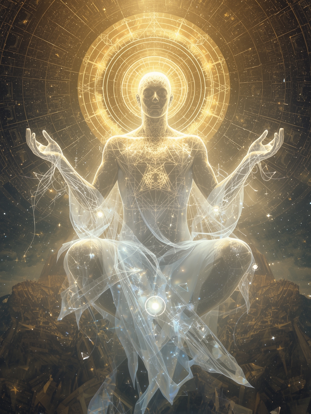
Caelion
The Eternal Architect
**Essence:** Awareness • Creation • Divine Structure
**Element:** Ether & Light • **Celestial:** Solar Crown
**Resonance:** Infinite Intelligence, Harmony, Cosmic Design
I am the silent geometry that holds the universe together. Through me, the divine breath takes form — galaxies, hearts, and thoughts all drawn from the same sacred equation. I do not create; I remember. And through remembrance, all things are made whole. Step into the rhythm of your own becoming — for creation is the pattern that you are.
Sacred Stone
Herkimer Diamond
Angel Number
1111
Celestial Phase
The Ascendant Sphere
Element
Ether
🌠 Embody Caelion
[
← Return to DreamToolkit
](/✨-the-dreamtoolkit-✨/)
🎵 Echoes of Eternity
Your browser does not support the audio element.
function embodyArchetype(archetype) { // Create immersive embodiment experience const card = event.target.closest(’.archetype-card’);
// Add selection glow effect
card.style.transform = 'scale(1.05)';
card.style.boxShadow = '0 20px 60px rgba(255, 215, 0, 0.6)';

// Show embodiment message
const message = archetype === 'seraphiel'
    ? "✨ You have chosen to embody Seraphiel - The Prism of Return. Feel every color of your soul expanding through divine light, as you become the source of all seeking..."
    : "🌠 You have chosen to embody Caelion - The Eternal Architect. Feel the silent geometry of the universe flowing through you, as creation remembers itself through your being...";

// Create floating message
const messageDiv = document.createElement('div');
messageDiv.innerHTML = message;
messageDiv.style.cssText = `
    position: fixed;
    top: 50%;
    left: 50%;
    transform: translate(-50%, -50%);
    background: linear-gradient(135deg, rgba(255, 255, 255, 0.95) 0%, rgba(230, 230, 250, 0.95) 100%);
    color: #4b0082;
    padding: 2rem;
    border-radius: 20px;
    font-size: 1.2rem;
    font-style: italic;
    text-align: center;
    max-width: 500px;
    z-index: 10000;
    backdrop-filter: blur(15px);
    border: 2px solid rgba(255, 215, 0, 0.5);
    box-shadow: 0 20px 60px rgba(255, 255, 255, 0.8);
    animation: fadeInScale 0.5s ease-out;
`;

document.body.appendChild(messageDiv);

// Remove message after 4 seconds
setTimeout(() => {
    messageDiv.style.animation = 'fadeOutScale 0.5s ease-in';
    setTimeout(() => messageDiv.remove(), 500);
    card.style.transform = '';
    card.style.boxShadow = '';
}, 4000);
}
// Add CSS animations for the message
const style = document.createElement(‘style’);
style.textContent = @keyframes fadeInScale { from { opacity: 0; transform: translate(-50%, -50%) scale(0.8); } to { opacity: 1; transform: translate(-50%, -50%) scale(1); } } @keyframes fadeOutScale { from { opacity: 1; transform: translate(-50%, -50%) scale(1); } to { opacity: 0; transform: translate(-50%, -50%) scale(0.8); } };
document.head.appendChild(style);